View your email with all of the images turned off to help you decide which images require the ALT attribute and which ones can have a null attribute.
For a deeper dive into understanding how context informs the use of the ALT attribute for your images, visit WebAim’s page on the ALT attribute.
Use role=”presentation” on all presentational tables
In email design, tables are used to hold content as well as structure the email’s design. Tables were never intended to be used for design. But due to restrictions in email clients such as Outlook, email designers have been forced to use the <table> element as a design element.
To help screen readers understand the difference between <table> elements that hold content and those that are purely for design, use role=”presentation” on each table that holds content the subscriber needs to read. You only need to add it to each <table> element, not every <td>. This avoids forcing a screen reader to read each cell of your tables one at a time and helps the subscriber get straight to the important content—and also improves the experience when subscribers choose to read emails aloud.
In addition to role=”presentation”, aria-hidden="true" is another HTML attribute that can be added to elements in your HTML that are for visual content and should be hidden from screen readers:
<table role="presentation" aria-hidden="true" cellpadding="0" cellspacing="0" border="0">
<tr>
<td></td>
</tr>
</table>
role="presentation" can also be used on images. It’s recommended to use the HTML attribute role=”presentation” on any image with an empty ALT attribute to avoid the name for the image being read.
Create emails that everyone can experience
Maximize your email’s impact by designing accessible content for all. Accessibility checks are always at your fingertips with Litmus.

Email accessibility in action
Let’s take a look at examples of accessible emails, submitted by the Litmus community.
Subscribers of this email will be able to increase the text size through their browser by up to 200% without breaking the design of the email. And it features an animated GIF that stops after three cycles (within five seconds) for those who suffer from photo-sensitive seizures.
Eyal Bitton created an email that uses copy for links that make sense out of context. They also signal to blind subscribers at the end of the email by using some hidden text.
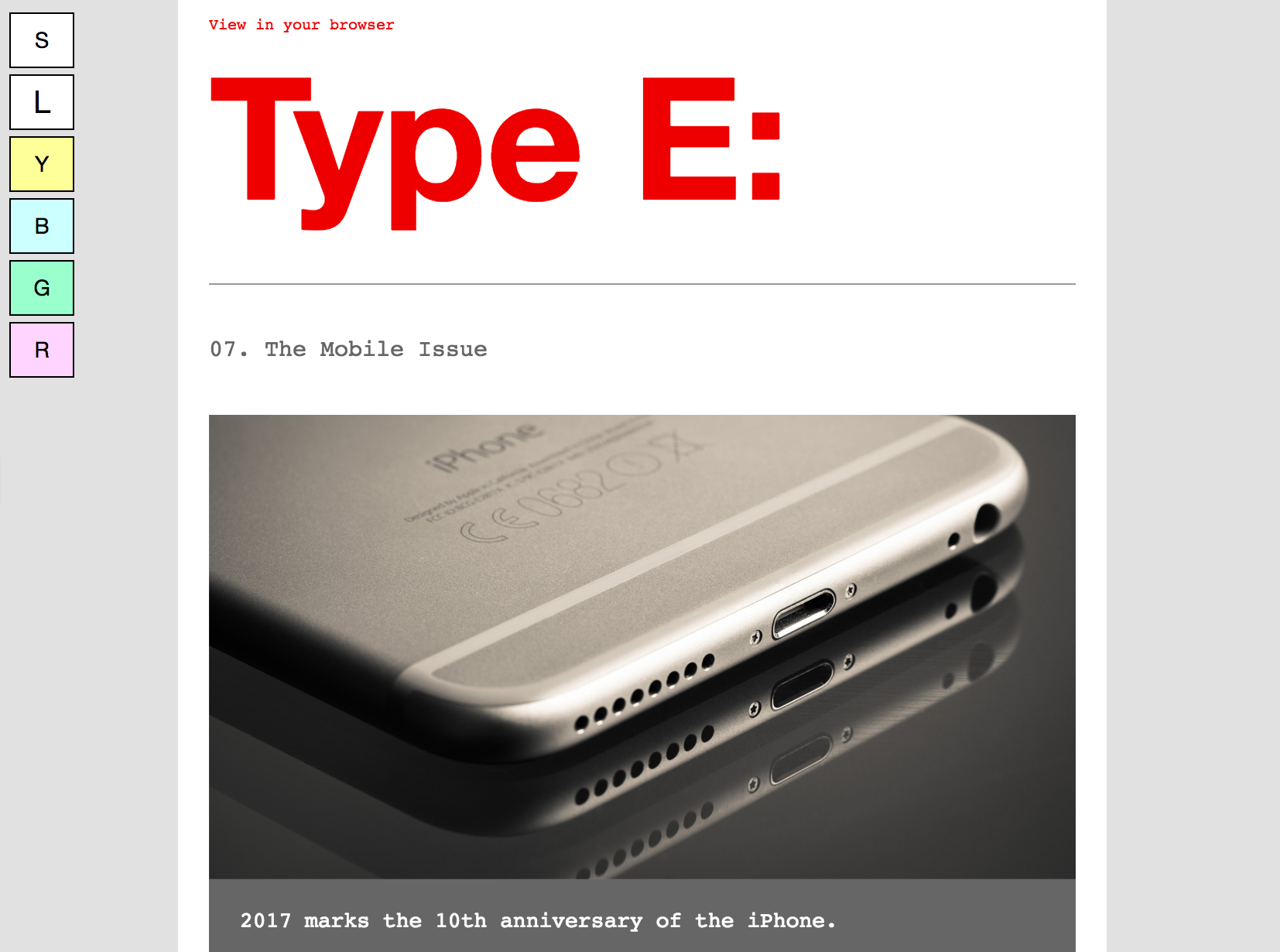
Type E’s newsletter uses an interactive progressive enhancement that enables the subscriber to choose from standard or large text size. Email developer Paul Airy also included an option–driven by an opt-in—where the subscriber can choose to display the email with tinted backgrounds if they suffer from certain disabilities.
These emails illustrate that it only takes a few small steps for emails to be more accessible and potentially reach a wider audience. Many of these steps not only aid accessibility but also help to improve your emails for everyone.
See your emails with images on and off
Want to see how your emails look in 100+ desktop, mobile, and webmail clients, including images-off views? Give email testing in Litmus a try, free! Try Litmus free ?
Educate your teams to scale accessibility adherence
Making emails accessible is the right choice, but to get your team on board, you might need to show the business value. Email is a highly effective channel with an impressive ROI of 36:1, and people with disabilities control over $1 trillion in annual disposable income. Ignoring accessibility means missing out on a key group of potential customers.
Start by creating accessible email templates that follow best practices, like live text and strong color contrast, making it easier for your team to maintain consistency across campaigns. Regular training and continuous learning will ensure everyone stays up-to-date on accessibility standards.
By integrating accessibility into your campaign planning and collaborating with different teams—design, development, and legal—you can make accessibility a routine part of your process. This not only helps meet standards but also builds stronger, lasting relationships with your audience.
Looking for tools to help make your email accessibility easier? Our built-in accessibility checker plus additional features can help make things easier for you:
Automatic accessibility checks
Scan your email for 40+ accessibility areas, with detailed reports and guidance on any issues found. With Litmus’ Email Builder, you can check your code as you work to ensure it meets your subscribers’ needs.

Visual impairment filters
Visual impairment filters offer four color vision deficiency options, allowing you to see how your email displays for subscribers with visual impairment.

NVDA screen reader preview
Our NVDA screen reader integration supports over 80 languages. The lang attribute helps screen readers accurately transcribe your message by indicating the language used to draft your email.
For more on accessibility testing in Litmus, visit our Help Center.
Start making a difference today
Maximize your email’s impact with Litmus to ensure accessibility and inclusivity for all subscribers — no matter their abilities.